- Joined
- Jan 16, 2013
- Messages
- 23,963
- Name
- Dennis
Please no!!! Do not change the horns!! Especially to look like a wasp stinger! If they do anything, let it just be widening the horns. Matte white I could deal with I suppose...Maybe..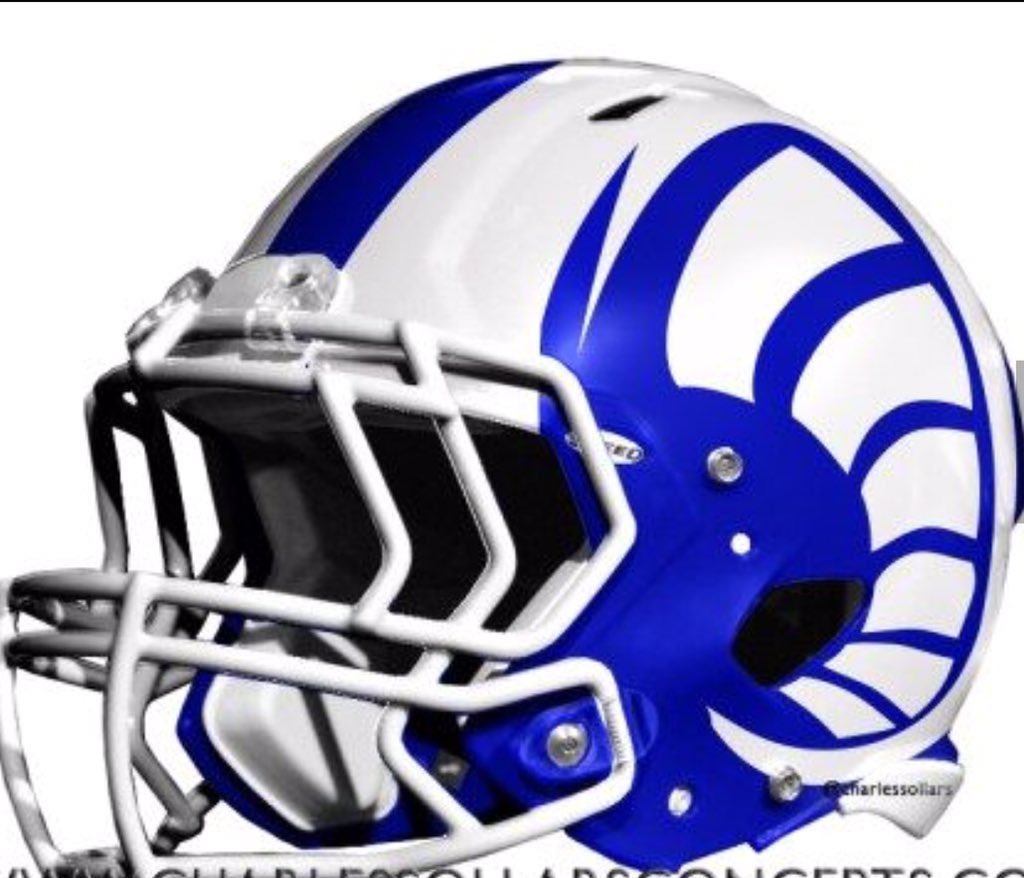
THIS with gloss blue and matte white, would be awesome.
My personal opinion .... UUUUUGGGGLY!!
THIS with gloss blue and matte white, would be awesome.
")
THIS with gloss blue and matte white, would be awesome.
We all pray we look and PLAY like the victors!.. looks like Michigan.

Demoff did mention last night that the new uniforms should be blue and yellow with the throwmbacks blue and white
But then , Demoff says a lot of things ,


Detroit Lions get new uniforms from NIKE
The Lions seem to like tweaking their uniforms every two or three years
But this is one of the few times , I actually kinda sorta like what NIKE did , they actually seemed to go in the opposite direction to what they normally do , and simplified it , removing all the black , and widened the center stripe on the helmet , and the helmets seem to have like a matted metal flack to them , so I hope they use the same approach with the new Rams uniforms
keep it simple
Matte doesn't work well on helmets unless it's metallic. Just no on the matte helmets please.
For the horns it probably wouldn't be too noticeable, hard to say. What matters moreso to me:
1. The fat base above the facemask. Just looks better all around.
2. Sharp point at the end that goes up moreso than a cinnamon roll curl. Too much curl doesn't look as fierce IMO.
3. Horn curl on the shoulders going around the numbers. Just hard to beat that look from the side.
I'm good with Blue and Whites. Good with Blue and Yellows. Good with even different colors being introduced. If they follow the above the uniforms will look good.
If it were me, in addition to the above I'd do the following:
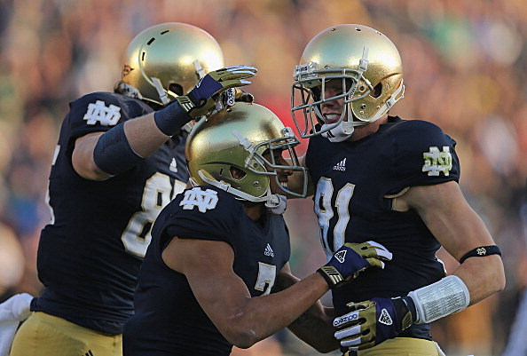
4. Notre Dame dark blue used in entire uniform.
5. Notre Dame metallic gold on the horns and used to outline portions of the uniform like the numbers.
6. Throwbacks would be Blue and Whites of the Fearsome Foursome fame.
I like the Blue and Yellows but the combination of the dark blue and metallic gold of Notre Dame fame would look amazing on our uniforms. Here's the colors:
Matte doesn't work well on helmets unless it's metallic. Just no on the matte helmets please.
For the horns it probably wouldn't be too noticeable, hard to say. What matters moreso to me:
1. The fat base above the facemask. Just looks better all around.
2. Sharp point at the end that goes up moreso than a cinnamon roll curl. Too much curl doesn't look as fierce IMO.
3. Horn curl on the shoulders going around the numbers. Just hard to beat that look from the side.
I'm good with Blue and Whites. Good with Blue and Yellows. Good with even different colors being introduced. If they follow the above the uniforms will look good.
If it were me, in addition to the above I'd do the following:
4. Notre Dame dark blue used in entire uniform.
5. Notre Dame metallic gold on the horns and used to outline portions of the uniform like the numbers.
6. Throwbacks would be Blue and Whites of the Fearsome Foursome fame.
I like the Blue and Yellows but the combination of the dark blue and metallic gold of Notre Dame fame would look amazing on our uniforms. Here's the colors:
No just NO I hate ND
